Through his art, Chris Breier invites viewers to explore the intricate relationships between colors and their emotional impact.


Olcott Boatyard at Sunset, 5×7, acrylic on Ampersand Canvas Texture Panel
Q: Your blog provides a wealth of valuable information for artists. How do you tailor your content to cater to both beginners seeking foundational skills and more experienced artists looking to refine their techniques?
One approach I use is to write an article for beginners and another more in-depth article on the same topic for more experienced artists. However, I can often write the same article to benefit both the beginner and the more experienced artist.
For example, the beginning of the article or video might answer the simple and more obvious questions, but I will go more in-depth into the topic in another section of the post. I can break it down into a series of articles if it’s a large enough topic.
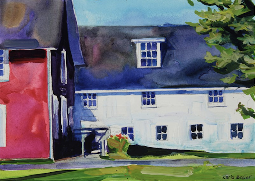
Barns, 5×7, acrylic on Ampersand Gessobord
Q: Your journey from working at a printer as a graphic designer to delving into color mixing is intriguing. Can you elaborate on whether your experiences in the printing industry influenced your approach to color theory and if they helped shape your current color mixing work?
Yes, working in the printing industry definitely influenced my approach to color theory. Actually, I began questioning color theory when I was in college. One confusing thing is that there are three models for color theory. There is the red, yellow, and blue for paint, CMYK for printing inks, and RGB for light.
It didn’t make sense to me that printing and painting would have two different color models since offset printing ink and paint are almost the same thing.
One important discovery for me was that magenta is the real primary color and that red is a color that you can mix. It was an interesting experience to read painting books on my own time that stated that you can’t mix red because it’s a primary color. Then, I would go into work and witness red being produced on all printing presses by printing magenta over yellow.
The CMYK color theory does apply to paints. With a little experimentation, I found that Quinacridone Magenta is the closest pigment to the magenta used for printing. Phthalo Blue is also close to cyan; you just need a transparent yellow. I’ve posted a number of videos where I mix red by adding a small amount of transparent yellow to Quinacridone Magenta. Here’s a YouTube short demonstrating this.
While it is possible to use a palette made up of CMYK for painting, I find it helps to add other colors to my palette. One reason why I add more colors to my palette is because the secondary colors that you mix aren’t always as vivid as the ones you can buy in a tube. Cadmium Orange is more vivid than the orange you can mix, for example.
It’s still helpful to become familiar with the CMYK color model, even if you use a lot of premixed colors, because it explains a lot of the issues with color mixing.
For instance, the common color theory claims that purple is a mixture of red and blue. However, anybody who has tried mixing Cadmium Red with Ultramarine Blue can tell you that it creates brown or a dull blueish purple, depending upon the ratio of each color.
Magenta works so much better for mixing brilliant purples.
Another formative experience was when I worked at a small greeting card company in the late 1990s, and we used to mix quarts of screen-printing inks by eye. I was already skilled at mixing colors when I started that job, but there’s something about working a job requiring exact color matching that will hone your color-matching skills.
I also worked the midnight shift at a phonebook company as a graphic artist. I spent the night designing phonebook ads and coloring clip art using the CMYK color model.
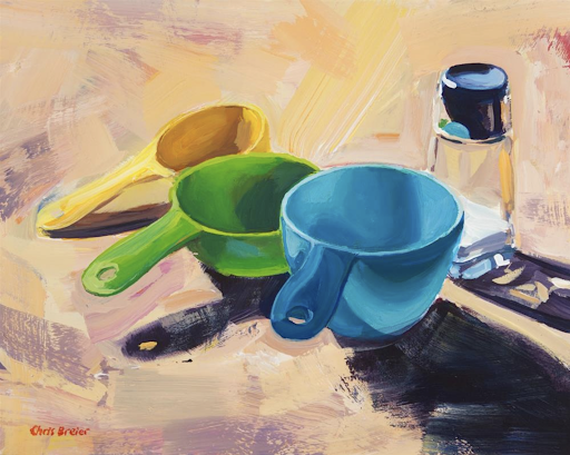
Measuring Cups, 8×10, acrylic on Ampersand Gessobord
Q: Embracing a creative career requires a different mindset than traditional employment. How did you mentally prepare for the shift from the structured routine of a job to the more flexible, self-directed nature of a full-time artist and content creator?
What’s interesting is that I feel like I already had the personality suited for self-employment and that the real struggle was trying to fit in at a regular 9-5 job for all of those years. Nevertheless, it still took some adjusting once I made the leap to self-employment. One thing that I understood from the beginning is that being a self-employed artist and content creator, I have to approach it as if I’m running a business… because it is a business.
That’s a point that anyone considering transitioning to being a full-time artist should consider. There’s more to it than painting or making videos all day long. I have to manage my retirement plan and health insurance, track my expenses for tax purposes, develop long and short-term plans, acquire equipment and art supplies, read contracts, solve technical problems, learn new skills, and manage my schedule. I enjoy doing all these tasks, so it fits me well. I enjoy having a flexible schedule because I can arrange things to suit my needs, leading to better quality work. I take responsibility for the results, whether they’re good or bad. If I dislike my hours or earnings, I need to look in the mirror!
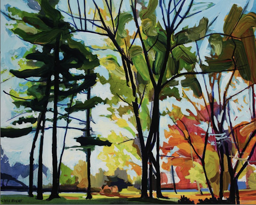
Autumn Trees, Glen Park, 8×10, acrylic on Ampersand Gessobord
Q: Some artists gravitate toward a signature medium, while others thrive on the diversity of mediums. How do you view the balance between specialization and versatility in your work?
I would say that I’m an artist who thrives on the diversity of mediums. I alternate between mediums to keep me motivated and to make things interesting. I can learn something new from trying out a new medium, and it can often be applied to other mediums. For example, I apply many techniques, from watercolor painting to acrylics. If I didn’t switch mediums occasionally, that would never happen.
Learning a new medium isn’t as difficult when you have the basics figured out.
It might not take as long to learn a new medium because I already know how to mix colors and how to draw. It’s just a matter of figuring out the differences between the new medium.
Within the past couple of years, I started working with water-mixable oils, and I like how I can clean my brushes with soap and water. I don’t like using solvents, so this has gotten me back into oils. I’ve adapted some oil painting techniques to acrylics, but that’s only possible because I was willing to experiment with slow-drying Open acrylics from Golden®. Regular fast-drying acrylics dry too quickly.
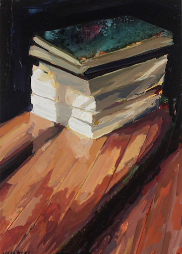
Books I, 7×5, acrylic on Ampersand Gessobord
Q: Acrylics and watercolors have distinct characteristics. How do you leverage the properties of acrylic paints to mimic the delicate and transparent qualities often associated with traditional watercolor painting?
One of the qualities of acrylics that is often overlooked is that they’re available in different viscosities. That means you can find heavy-body acrylics that are as thick as oils but also fluid acrylics and acrylic inks. Therefore, using the thinner acrylics for watercolor techniques makes sense, so you don’t have to add as much water to get them to flow. This will keep the colors more vibrant.
Once you have a thin acrylic paint, it’s a matter of using those watercolor techniques almost the same way. You have to become familiar with how water tends to flow on paper.
Watercolor also taught me to take advantage of random effects and be more flexible because it’s a somewhat unpredictable medium. That’s another example of how playing around with different mediums can be beneficial.
You mentioned watercolor’s transparent qualities, so using mostly transparent paints is another way to leverage acrylics. The modern pigments, such as the Quinacridones and the Phthalos, are very transparent. They’re also highly saturated, so you can use them to create vivid washes of color that watercolors are known for.
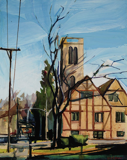
Church on Milton Street, 10×8, acrylic on Ampersand Gessobord
Q: Some artists use techniques like palette knife painting to enhance the expressive qualities of their work. Do you incorporate specific methods or tools that contribute to your distinctive painting style?
When I use acrylics like watercolors, I will paint with the panel lying flat on a table to create wash-like effects without having it drip too much. I sometimes use spray bottles to mist an area of the painting to encourage the paint to flow into other areas.
I also use a spray bottle to create course droplets of water that will disturb the paint. Toothbrushes can be used to create fine spatters of paint, but I try not to overdo it. Acrylic markers are another convenient tool that I’ve been playing around with. I use them to put in fine lines and other details. The nib of the marker is rigid, so it makes it much easier to paint straight lines compared to using a brush. You can also use a ruler or circle templates to draw more precise lines.
It’s important to use markers that contain acrylic paint because they’re lightfast. I like the markers from Liquitex® and Posca. The problem with regular markers is they often fade when exposed to UV light for long periods. Plus, they can bleed through layers when you paint over them. I’m always testing new tools and materials, and my style tends to evolve.
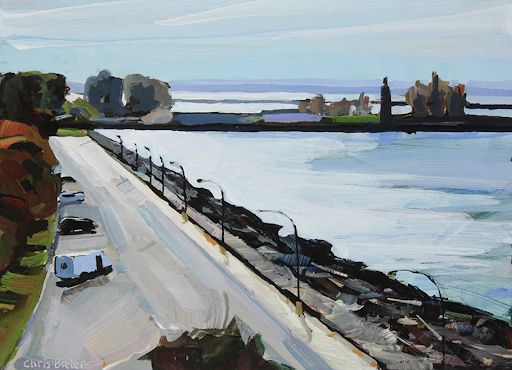
Lake Erie, 5×7, acrylic on Ampersand Gessobord
Q: What do you love most about Ampersand for your work?
What I love about using Ampersand products is that they’re very consistent, and the panels are ready to paint on without any preparation. This allows me to focus more on painting rather than preparing panels or frames myself.
Gessobords are made from a higher quality hardboard than I can find in the home improvement stores. They seem more rigid than the 1/8″ hardboards that I’ve tested. I’m not the greatest woodworker, so I appreciate that every panel is perfectly square. I like how the panels have sanded smooth edges and slightly rounded over.
I find that Gessobords are very versatile. You can use them as they are, but I also like using them for making my own canvas panels, or I’ll add other textures to them with gels, modeling paste, or super heavy gesso.
Ampersand FloaterFrames are another favorite because they make it easier for me to frame my paintings. I like the simple and modern look, and they’re easy to use, especially when you use them with a cradled Gessobord. I can frame a cradled Gessobord within minutes. That’s much more convenient and less expensive than hiring a picture framer.
Artist Bio:
Chris Breier is an artist from Buffalo, NY. He works in acrylics in a variety of genres, both abstract and representational. His artwork has been featured in The Artist’s Magazine and several books.
Chris has been posting color-mixing demos on social media for years. Some of his videos have been featured by BuzzFeed and other media outlets. To see more of Chris’ work, visit his website, Instagram, Blog, and YouTube.