Who’s Who is a feature that showcases a member of our industry community who is doing an incredible job. If you would like to nominate someone for a Who’s Who feature, please email us at artdogblog (@) macphersonart.com with their name, position, company and a short description of why you would like to nominate them.
Historically our Buyer’s Guide has had one designated project manager, or “quarterback,” as our CEO Dave Schofield would say. Six years ago Corinne Smith took the reigns, infusing the cover design with her curiosity, hands-on approach and love of craft. In addition to the covers, Corinne also creates the layout and overall design of the guide in close collaboration with the Category Management team.
Corinne has been at MacPherson’s for fourteen years this February; she started in Customer Service and moved over to Creative Services after about three years, now serving as a Senior Graphic Designer. “This was my first real job. MacPherson’s appealed to me because even though I started in customer service, I was still supporting creative endeavors. We may not make art here, but we’re still supporting the arts.”
Outside of work, Corinne is an avid quilter. She has a big family and creates with gift-giving in mind. The design skill set she brings to the Buyer’s Guide ties into her textile art; both require well-thought out layers, curated colors and above all, a plan.

Evolution, Inspiration, Collaboration
When Corinne first started working on the guide, it was essentially a 63-page game of Tetris. She worked off of a spreadsheet from Category Management, scheming and strategizing as to just how many items could fit on a page. In 2017 the Buyer’s Guide as we knew it was put on hold, as we took stock of the guide and decided to launch a new concept.
The initial brainstorm session included account managers, the category team as well as members of creative services. The group identified key areas that could help retailers; the vision took shape as “an inspirational solution-based sales tool” with features such as community events, trends and helpful projects, supported with both traditional and lifestyle imagery.
New content meant a new approach to design. Corinne’s workflow was no longer primarily spreadsheets and tetris; she introduced lush imagery, lifestyle images, calculated “architecture” (a fancy design word for how information is arranged on a page) and a sense of flow. The idea of a continuous flow, with specific, valuable information laid out clearly, is made possible through teamwork. “The process is very collaborative,” Corinne emphasizes. “The Merchandising team goes back and forth with me, we go back and forth with vendors; it’s a partnership and collaboration. As a group, we really care and think about the impact of our content hand in hand with the design.”
The changes also presented a challenge: balancing the dual purposes of the guide. While it is a sales tool and a way to showcase our partners and promotions, we also want it to be visually inspirational for retailers. “Being a designer, I want the lush images, clean designs and pages that tell the story of the feature. Then there is the expansive amount of the details and information we want to include. Finding the balance between the two is sometimes hard. We want to make sure that every inch of every page is valuable.”

The Cover Story
What inspires a cover design? Why this medium? How is it created? These are all questions Corinne considers before embarking on a cover design. “Either it comes to me, or it is tied into a trend. If there is something I want to try, I do that. We try to keep it seasonal and sometimes it’s more abstract, with color playing a crucial role.” Corinne’s specialty is papercraft, and her passion (and knack for) manipulating paper shows up in her cover designs. She takes pride in the details, from tissue paper collage to quilling to paper flowers. Her covers typically incorporate original artwork and a design aesthetic that honors the arts. Wherever the ideas come from, behind each cover Corinne has put together, there is a story. We invite you to a behind-the-scenes look at each season:

Back-To-School Fall 2015
This cover is my favorite because of the story behind it. Reminiscent of papercrafting but with a DIY / found object twist, these gold-painted leaves were hand picked for their autumnal colors, delicate textures and pleasing shapes. An easy feat for someone taking a leisurely stroll through an East Coast town in October…Cut to Corrine on tip toe, inspecting summer leaves at 8am in a suburban park in California. Staring avidly at each individual leaf, hunting for the discolored ones among the green. Holding the leaf up to the light, she asks herself, Does this read as fall? “I felt like a crazy lady, and I got some weird looks from people walking their dogs that morning. I spent a good hour or so leaf-hunting.” Her hunt paid off with a stunning fall cover that makes this native New Yorker feel right at home.

Holiday Buyer’s Guide 2016
The idea for this cover struck before anyone was even talking about pencil shaving art. After a particularly busy STABILO Woody 3-in-1 demo, the Category Manager who ran the demo brought the shavings back to the office. She had no specific plan for the colorful pile, but the instinct to save something that others might otherwise throw away tends to pay off when you work with creative people. When Corinne saw the pile of colorful shavings, her mind went to confetti, and then to party and then—Holiday. Yes! The cover was there, in the shavings, waiting to be created.

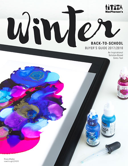
Winter Back-to-School 2017/2018
Corinne makes a point to try trends herself to see what it’s all about. Alcohol ink on YUPO paper was a big hit, and while she enjoyed the process, she struggled with getting an image that illustrated the artform while also meeting her design standards. She had wanted to do rich, wintry blues, but the color wasn’t translating. She and Category Manager Jeanine Davids actually came in on a Saturday to experiment, and that’s when the lightbulb (literally) went off—an Artograph lightbox set off the color. Corinne revisited a stack of samples that the team had put together to discover a beautifully done piece by Category Manager Lisa Allgeier that incorporated jewel tones with a metallic punch. Through trial, error and collaboration, it was a wrap.


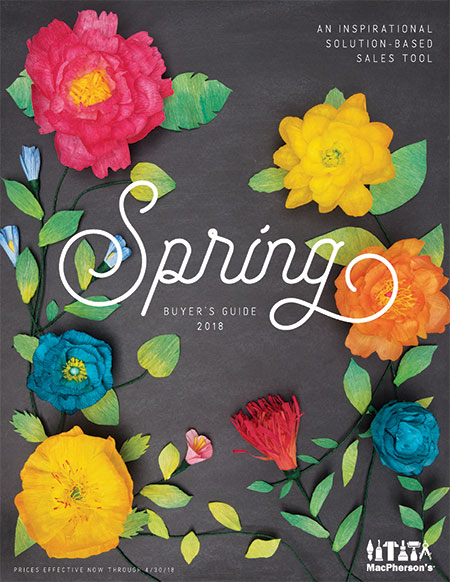
Spring 2018
A recent one, the cover for Spring 2018, is a company favorite. Corinne had been wanting to try a more in-depth version of the flower papercraft she had created for a 2013 cover. Each leaf and petal in this image is hand painted, cut and folded. She outlines her process, which took about two days: “I cut plain white crepe paper sheets into petal size strips approx 3″ x 20″. I then painted the strips in an ombre color fade so that the colors would be darkest on the tips of the larger outside petals and would get lighter as they got smaller towards the center of the flower. I used the concentrated liquid inks to get the more vibrant colors and mixed those with colors from a 36-pan watercolor set I have had for years. Once the paper was dry, I cut out the individual petals and started gluing. Floral wire and a ball of crepe paper scraps started as the base of the flower; I glued each petal to the base using Elmer’s craft bond less mess hot glue to put it all together.”
What Do You Think?
The decisions that shape the Buyer’s Guide are focused on how you, the retailer, buyer, owner, staff member will use the guide. How does Corrine envision you using the guide? “Every single day, all day,” Corinne answers with a grin. In all seriousness though: “I hope you see it as a useful tool, getting creative ideas on how to bring people in, engage and inspire consumers to create art.” Her favorite part of the process: “When I finish a spread or a cover and I look at it and feel it will truly make an impact.”
The Winter Back To School Buyer’s Guide is officially live! Click here to view it online and keep an eye out for the hard copy in your mailbox. Click here to learn more about how you can utilize the engagement calendar for National Handwriting Day in January. To share how the Buyer’s Guide has impacted you, your team and/or your store, comment below or email us at artdogblog (@) macphersonart.com. Corinne, the Category Management team and the rest of us in Creative Services would love to hear your feedback and comments.


One Comment
Shelley Mathews
Great article and beautiful art!