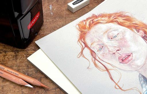
Most of the world we see is a mid-tone – the darkest darks of our blackest pencils marks and the bright white of bleached paper are rare occurrences in the visual world. Prior to the 20th Century, few artists drew on paper as white as the surfaces we have become familiar with and most historical work was made on off-white papers as varied as the local manufacturers that produced them. In this blog, I’ll take you through a portrait of Immie that I drew in Derwent Lightfast Derwent Lightfast colour pencil on toned mixed media paper.
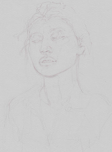
Stage 1: Rough Underdrawing
Colours: Taupe
Working from a photograph I made the loose establishing drawing in Lightfast Taupe – a warm mid tone coloured pencil that would be easily covered by the later layers. I always hold the pencil with an underhand grip for these drawings to allow for lighter, more energetic marks.
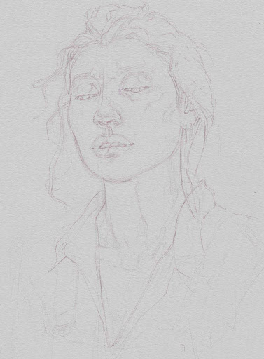
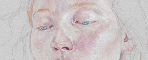
Stage 2: Tonal Map
Colours: Taupe
Building upon the rough underdrawings I loosely delineating a map of the most important shapes of tone and colour in the face. Although this is one of the least impactful stages of the drawing it is also the most important, laying the foundations for everything that will follow.
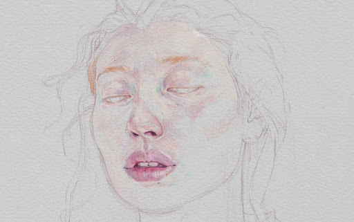
Stage 3: Light cools
Colours: Wild Lavender, Turquoise Green
It is easy to overlook the cool colours of the face, so I like to establish them early – picking out the subtle turquoise and lavender hues in the skin before moving on to the warmer details. The relative cool of the grey paper, compared to the warmth of skin, will happily stand in for many of the light shadows of the face.

Stage 4: Features
Colours: Flesh Pink, Salmon, Derwent Red, Deep Rose, Oyster, Burnt Sienna
At this stage colour comes to the face! Making marks in the directions of the surface of skin and using my earlier tonal map for guidance I started to fill in shapes of warm colour on the skin, leaving plenty of the light grey paper showing through. This included the dark of the nostrils, the rims of the eyelids and the shadows that sit between the lips and teeth. Ultimately I will work out from the features to cover all of the skin in a similar patchwork of coloured shapes.
Stage 5: Highlights
Colours: White
At this stage the midtone paper really comes into its own – using the same directional marks that I used in the previous stage I built up broad areas of subtle light on the cheek and temple, and sharp edges of concentrated highlights around the features. These highlights not only emphasize the form of the head but create strong contrasts with the warm darks of the features, drawing attention to the expressive elements of Immie’s face.

Stage 6: Eyes
Colours: Dark Turquoise, White
Despite establishing the shapes of the irises of the eye and surrounding negative spaces of the whites early in the drawing I prefer to elaborate upon the detail of the eye later than the other features to avoid them staring back at me as I draw. I used White and Dark turquoise to both pick out the colour of the iris and contrast with the reds and oranges of Immie’s skin and hair.
Stage 7: Hair
Colours: Venetian Red, Champagne, Deep Rose, Burnt Sienna
The hair straddles several stages of drawing – I established its shape early in the portrait, but returned to the bands of orange colouring much later, using colours that would again appear in the freckles of the face. I tried to work as faithfully as possible from my references, avoiding the temptation to draw individual hairs. Once the shirt was drawn I added further whisps of hair over the collar and darkened the hair as it receded away around the back of the head.

Stage 8: Shirt
Colours: Taupe, Dark Turquoise, White
The pattern on the shirt mirrors the botanical commission that I also produced alongside this drawing of Immie – a plant from the glass houses at Kew Gardens first sketched on a trip some years ago. Starting with the shapes in Taupe I filled in the shapes of tone and colour, echoing the colour palette I’d used in the eyes.

Stage 9: Freckles
Colours: Burnt Sienna
I find it easiest to add freckles at a later stage once the balance of tone and colour in the skin has already been established. Adding them need not be slow, but they should be drawn with a delicate hand, with attention paid to how dark or pale they appear in relation to the surrounding skin. A single freckle might vary in tone as it crosses the boundary of a shadow, like the dash of pigmentation that borders Immie’s lip – a drawing that includes freckles must be sensitive to these changes.

Stage 10: Finishing balance
Colours: All of the above
Stepping back from the drawing I always find it important to make a final appraisal of the whole before deciding it is complete. I make a few final adjustments in a variety of colours, bring an eraser in to lighten or clean up a few areas before stepping away and declaring it finished.

Artist Bio: Jake Spicer
“ Jake Spicer is a Brighton-based artist, drawing tutor and author of several popular instructional drawing books, most recently ‘DRAW’ published by Ilex Press. Through his teaching and writing Jake aims to make drawing accessible to everybody, on the understanding that everybody can learn to draw and anybody that can draw can always learn to draw better. Jake is head tutor at Draw where he runs a nine-month Atelier course and teaches life drawing, he is also founder and co-director of the award-winning Drawing Circus and a monthly contributor to Artist & Illustrators magazine. “
Thank you to Jake Spicer for providing this blog for us. You can discover his work on his website, Instagram and Facebook.


