NAMTA 2019 has come and gone, with much to reflect on in the coming year. Exhibitors pour time and effort into their booth designs, partners travel from all over the world to connect in person. Though it seems like it is all over in a just a few days, the impact is lasting, especially when specific strategies are applied in stores.

If you were there you may have noticed a mass of curly hair behind a camera—that was me, the Art Dog reporter, experiencing NAMTA for the very first time. Between meeting vendor partners, connecting face to face with customers I’ve only ever chatted with on the phone (or seen via their Instagram stories) and ogling over new art materials, I had a lot to process after I arrived back in Emeryville last week. Looking back on the experience, certain booths stood out as potential merchandising inspiration for our retailer community. In celebrating these booths, I hope to pique your interest in refreshing and optimizing your space.
Booth Concepts
While one might think that any space fully stocked with art supplies should be inviting to a creative person, there are a few crucial ingredients that drive traffic while also creating a meaningful experience. Here are some key merchandising strategies that left a lasting impression.
Best Lit
Like moths to a flame, people will beeline for anything glittering or shimmering. Even if glitter isn’t our “thing,” we can’t help but slow down and look closer. The team at Pebeo knows this, and that is why for every show they pack enough for a movie set. Their space was warm, bright and inviting.

On one side, they arranged products as well as a table for conversations with visitors. On the other side, their artist Tristina Dietz demonstrated combinations of products, including resin, glitter paste and pouring mediums.

The fantastic colors, with pearlescent and glittering effects, were showcased beautifully in the light and the ample space Pebeo left open allowed visitors to congregate around Tristina, ooo-ing and aww-ing.
Statement Booths
These two booths couldn’t look any different, but they are doing the same thing: making a statement. Picking one thing and doing it well.

For Legion, they celebrated the launch of their new Stonehenge Aqua paper, leaving an unforgettable impression on the visitor. Their all black booth (which won Best Small Booth at NAMTA) had a gallery feel, showcasing works of art on the new paper and an interactive photo booth to draw interest.

Jacquard on the other hand, chose all the colors for a kaleidoscope of epic patterns that came together in a paradoxically cohesive booth. When it comes to merchandising, a try-table or even an end-cap, you can make an eye-catching, bold choice like this too.
Best Vibes
Royal Talens has used this booth design before; if it works, use it. Make it “your thing.” The booth was fun, inviting and a cool place to hang out.

Their team greeted everyone warmly, showing us around and offering simple comforts that we all need at these marathon-style events: coffee, chapstick and a welcoming space to chat.

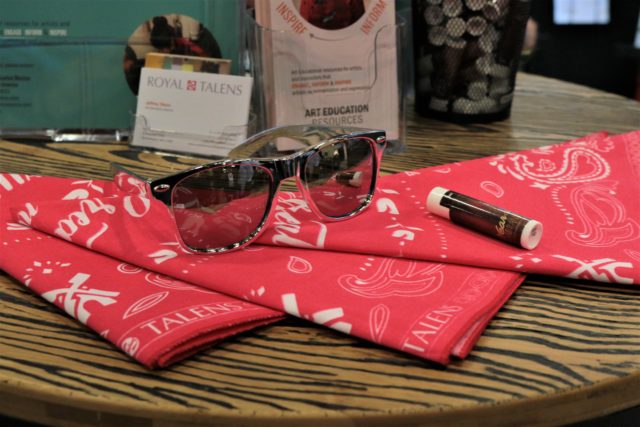
The space was Rembrandt themed in honor of the Year of Rembrandt, with a vineyard feel (hanging lights and vines), an espresso and stroopwafel station and complementary chapstick (perfect for the dry San Antonio climate, with a clever label featuring Rembrandt’s lips, courtesy of Education Director Jeffrey Olson).
Their demo artist, Vic Hollins, was friendly and engaging, sitting in the corner creating vibrant pearlescent and metallic works of art. It was a lot of small touches—the warm greeting, the comfort of caffeine, the celebration of art history—that made their booth magnetic. How might you utilize your store’s history, or a theme in art history, to draw interest from the passerby? Might a small comfort, like coffee or tea, make customers feel more at home in your store?
Best Flow
NAMTA can be a chaotic experience. For the visitor who is coming into your booth clearly delineated stations are a relief. Having designated or themed stations allows for a flow and brings a sense of order to the experience of your booth. This is where I can try product? Great, let me at that new fineliner. Oh, a seated area with flowers and promo sheets? Let’s talk business.

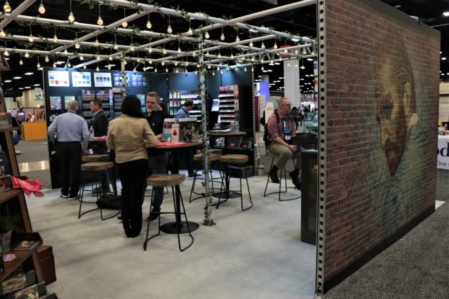
In the Sennelier booth various stations made moving through the booth, interacting with the team and trying out the art materials a seamless experience.

One key choice: the try-table had plenty of space around it for people to gather around, with no displays or extra product crowding the workspace. The openness of this layout leaves room for experimentation and hands-on exploration; the try-table is approachable and easy to access.
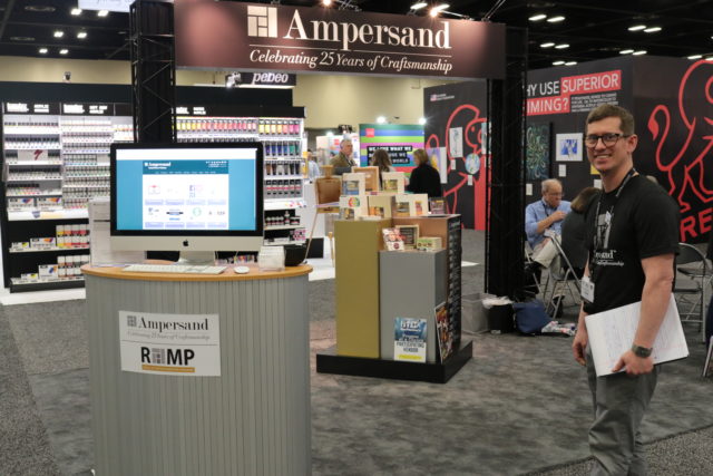
In the Ampersand booth, for example a large monitor brought for the purpose of showing off a new online system allows for direct communication.

When designing a space, think about how each station functions on it’s own. Does it have everything you need for that specific action? Is one station more crowded than the other? This was a key focus for MacPherson’s when we designed our own booth; next week we’ll be showcasing the rationale behind our design, with a focus on affordable merchandising solutions and movement through the space.
Best In Show
The booth that handed all of these components with consistency and grace? GOLDEN Artist’s Materials. They also happened to win NAMTA’s award for Best Large Booth of the Show.

GOLDEN’s booth combined all the features above into one experience. Instead of big, bold lighting throughout, they utilized gallery-style lighting emphasized by the contrast of softly lit, projected images and soothing, nondescript music.

The overall result was a retreat from the noise and bustle of the floor, transporting the visitor to a tranquil, inviting space. GOLDEN’s focus on education shone through the entire design; clearly demarcated sections clue you in on what you are looking at.


As a highly visual person (not uncommon in this industry, I’m sure), I appreciated the easy to understand, focused design of their booth. There was just enough to look at. The simplicity of the signage allowed me to take in the products. After touring the New Products, Marketing, Merchandising and Education sections, visitors circle over to tables to talk business.
Taking the Inspiration Home
Lighting, statement, flow, vibe and overall ambiance. It’s a lot to think about. If you are open to refreshing your space this year, you might take stock. Which categories are working well? Which could use some TLC?
Lighting is a great place to start, and you don’t need expensive equipment to do the job. A little light goes a long way: LED inserts can give a dim counterspace new life.
As for making a statement, this is where window displays or wacky end-caps come in. Identify a handy member of your team and task them with a seasonal display; go minimal like Legion, or decadent like Jacquard.
Then, the “flow” of your space. Consider rearranging to better serve your customers, whether it’s managing the line, switching up where the try-it stations are, or investing in some innovative storage solutions to save space. Depending on how involved you are on the floor, understanding the hiccups in your store’s flow may require a team meeting.
Vibe and ambiance go hand in hand. What’s the music like in your store? Do you have seasonal perks for customers? A place to put umbrellas? Treats for canine visitors? These small touches bring hygge to your store and increase the likelihood that people will drop in to say hi and do more than window shop.

The Demo in a Box
Aside from on-point booth designs and merchandising inspiration, the innovative practice of providing retailers with a Demo in a Box did not go unnoticed. Dana Brown of Ampersand hosted a demo on the concept, encouraging retailers to take advantage of this resource: both as a demo for customers but also as a training strategy or refresher for staff. In the GOLDEN booth, President Bill Hartman explained the rationale behind their recent redesign of their demo in a box. Not only does the box include an itemized list and unpacking instructions, it includes lesson plans with allotted time as well as physical examples of product applied to sturdy foam core. GOLDEN and Ampersand aren’t alone in this! We’ll be exploring this idea of a Demo in a Box more in the coming months.
 FOMO? Check Instagram Stories
If you didn’t attend NAMTA or simply felt like you missed out on some experiences while you were there, check out our Highlights on Instagram. “Highlights” are essentially Instagram Stories from the event that I felt were worth saving (I did not, for instance, save my shaky tour of our booth; I did, however save posts that showcased our vendor partners and provided fun visuals). I can’t stress how useful Instagram Stories are for sharing information and creating a sense of timeliness. We had the most engagement on social media yet over our NAMTA stories! Special thanks to the social media team Flax Art Supply, whose Maybe Mondays inspired me to try stories.
Looking Forward
NAMTA is a great chance to network with our community, connect directly with partners and customers, see new products in action, introduce new staff (like myself) to the community, reconnect with old friends and take part in shaping who we are as an industry. Not to mention the promos and great deals designed to set you up for 2nd quarter success! Next year NAMTA 2020 will take place in Chicago.