Hey friends, Ali LePere here! Fall is finally here and with it comes a whole bunch of exciting color opportunities. Whether you’re lettering, illustrating, or picking the perfect palette for your planner, we all have color choices to make. But have you been stumped when picking out colors for a project? I know I have! That’s why I’m going to show you the basics for picking out the perfect colors for every kind of fall vibe. Then I’m going to show you which Dual Brush Pen sets will do the color-picking work for you!
Supplies:
- Tombow Dual Brush Pens
- Dual Brush Pen Set, Bohemian, 10 PK
- Dual Brush Pen Set, Desert Flora, 10 PK
- Dual Brush Pen Set, Cottage, 10 PK
- Dual Brush Pen Set, Muted, 10 PK
- Dual Brush Pen Set, Secondary, 10 PK
- Water Brush
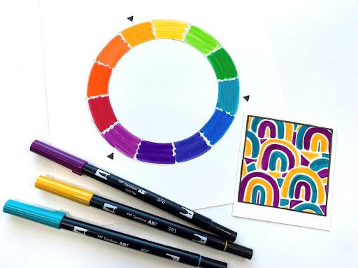
The Color Wheel
I used to be mystified by the color wheel, but it’s simple when you break it down.
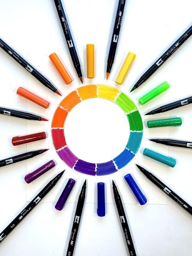
The wheel has twelve different colors on it. First and foremost, it has the primary and secondary color trios. Red, yellow, and blue are the primary colors and orange, green, and violet are the secondary colors. These colors are spaced apart in the color wheel in rainbow order.

There are also colors in between each primary and secondary color. These are called tertiary colors. There are six in total and they are made by combining a primary and secondary color together. The tertiary colors are red-orange, yellow-orange, yellow-green, blue-green, blue-violet, and red-violet.
Here is the order in which the colors appear on the wheel. I also added the number Tombow Dual Brush Pen I chose to represent each color.
- Red: 847
- Red-Orange: 905
- Orange: 925
- Yellow-Orange: 993
- Yellow: 025
- Yellow-Green: 173
- Green: 245
- Blue-Green: 407
- Blue: 535
- Blue-Violet: 565
- Violet: 636
- Red-Violet: 676
Combining Colors
While it’s true that we don’t have to adhere to the “rules” when we make art, it’s also true that some color combinations work better than others. I’m going to show you how to make a few color groupings that are considered harmonious.
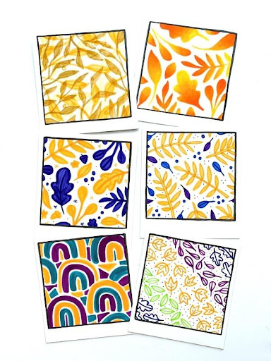
Monochromatic
To make a monochromatic color scheme, I use a single color and change it to make different tints, tones, and shades. Here I used the 993 Dual Brush Pen to make a simple monochromatic illustration. This is my favorite fall color and will be the key color in many of the illustrations in this post!

Now you may be asking, “How do I make these different colors?” The key is knowing the difference between tints, tones, and shades and how to make each of them. In the image below you can see four swatches. The first one is a simple swatch of the 817 Dual Brush Pen. The rest of them are variations of that same color.

- Tints are colors with white added to them. To add white to ink from my marker, I simply used the Tombow Small Water Brush to dilute the original color.
- Tones are colors with gray added to them. I used the 817 and N57 Dual Brush Pens to color the swatch. Then I used the Small Water Brush to blend the colors together. The more gray you add, the less of the original color will show.
- Shades are colors with black added to them. I used the 817 and N15 Dual Brush Pens to color the swatch. Then I used the Small Water Brush to blend the colors together. Similarly to making tones, the more black you add, the less of the original color will show.
Analogous
To make an analogous color scheme, I use colors next to each other on the color wheel. I made this illustration using 925, 993, and 025 (orange, yellow-orange, and yellow). Analogous color schemes are perfect for any project that requires blending. These colors will transition seamlessly while blending them!

Complementary
The complementary color combinations consist of two colors that oppose each other on the color wheel. You know how they say opposites attract? That’s the case with these color combinations! Here I used the 993 and 565 colors (yellow-orange and blue-violet).
Split Complementary
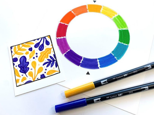
These color schemes consist of three colors and they’re similar to regular complementary combinations. To make this color scheme, I chose my key color (yellow-orange). Then I found the color opposite it on the color wheel (blue-violet), and chose the two colors adjacent to it (blue and violet). I used the 993, 535, and 636 Dual Brush Pens for this color combination. I relied more heavily on the yellow-orange because I knew that the two cool tone colors could easily overpower the fall vibes I was trying to achieve. I used the blue and violet colors more as accents in this illustration.

Triad
Triad color combinations are made up of three colors that are equally spaced from one another on the color wheel. I chose three tertiary colors to make one of my favorite fall color combinations (specifically yellow-orange, red-violet, and blue-green)! I used the Dual Brush Pens in 993, 676, and 407 to make this illustration. This is another example of a color combination that isn’t traditional for fall, but still manages to convey the earthy warmth and vibrancy of the season!
Tetrad
Tetrad color schemes are made up of two pairs of complementary colors. I chose the complementary colors I used earlier (993 and 565) and added yellow-green and red-violet (173 and 676). For this illustration, I wanted to capture a warm and slightly less traditional back-to-school vibe. I’m a big fan of the back-to-school season and how it seems to kick off f coall for everyone! Rather than sticking to primary colors, I went for something a little warmer and darker, but with some left-over summer energy!

The Best Pre-Made Color Palettes for Fall
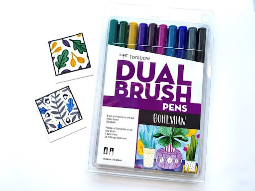
Bohemian
It doesn’t have the traditional reds, oranges, and browns you’d find in a more traditional Fall palette, but it’s definitely jewel tone heaven! These colors remind me of when then all of the leaves have fallen and the only way to keep warm is snuggling under a blanket with some hot tea. This is the November of Dual Brush Pen sets. You can find the Bohemian Dual Brush Pen 10-Pack here!
Desert Flora & Cottage
These two palettes are some of the most versatile Dual Brush Pen sets on the market. They are timeless and usable for any season. It’s possible to create just about any kind of project with these! I grab the Desert Flora Dual Brush Pen 10-Pack for projects inspired by early and late Fall. This palette can be warm but also a little gloomy. I love the Cottage Dual Brush Pen 10-Pack for some beautiful and warm jewel tones, but also for light and airy neutrals!

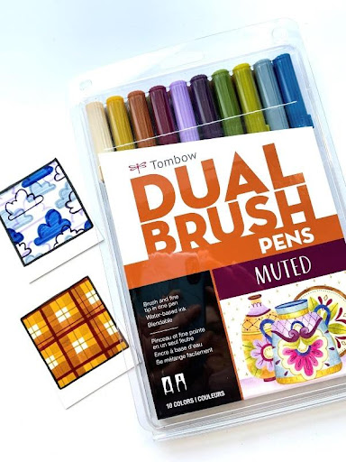
Muted
This palette is the perfect rainbow of colors for any Fall project. Whether you’re trying to make some Fall foliage or capture the blue and grays of the late season, the Muted set has you covered. This is a particularly great palette for experimenting with the tints, tones, and shades we talked about earlier. You can find the Muted Dual Brush Pen 10-Pack here!
Secondary
This is the quintessential Fall palette. Similar to the Muted palette, you’re able to create all of the Fall foliage. The only difference is that these colors are more vibrant and replicate the shocking vibrancy of the season a little better! You’re also able to create less traditional color combinations as well as capture some of the late season chill with the cooler tones in the set. This is definitely the set I’ve been reaching for the most this season! You can find the Secondary Dual Brush Pen 10-Pack here!

Until next time, have fun with all of those Fall colors!